
XFINITY: A HISTORY OF SHOWCASES
The Glow WORLD PLUS
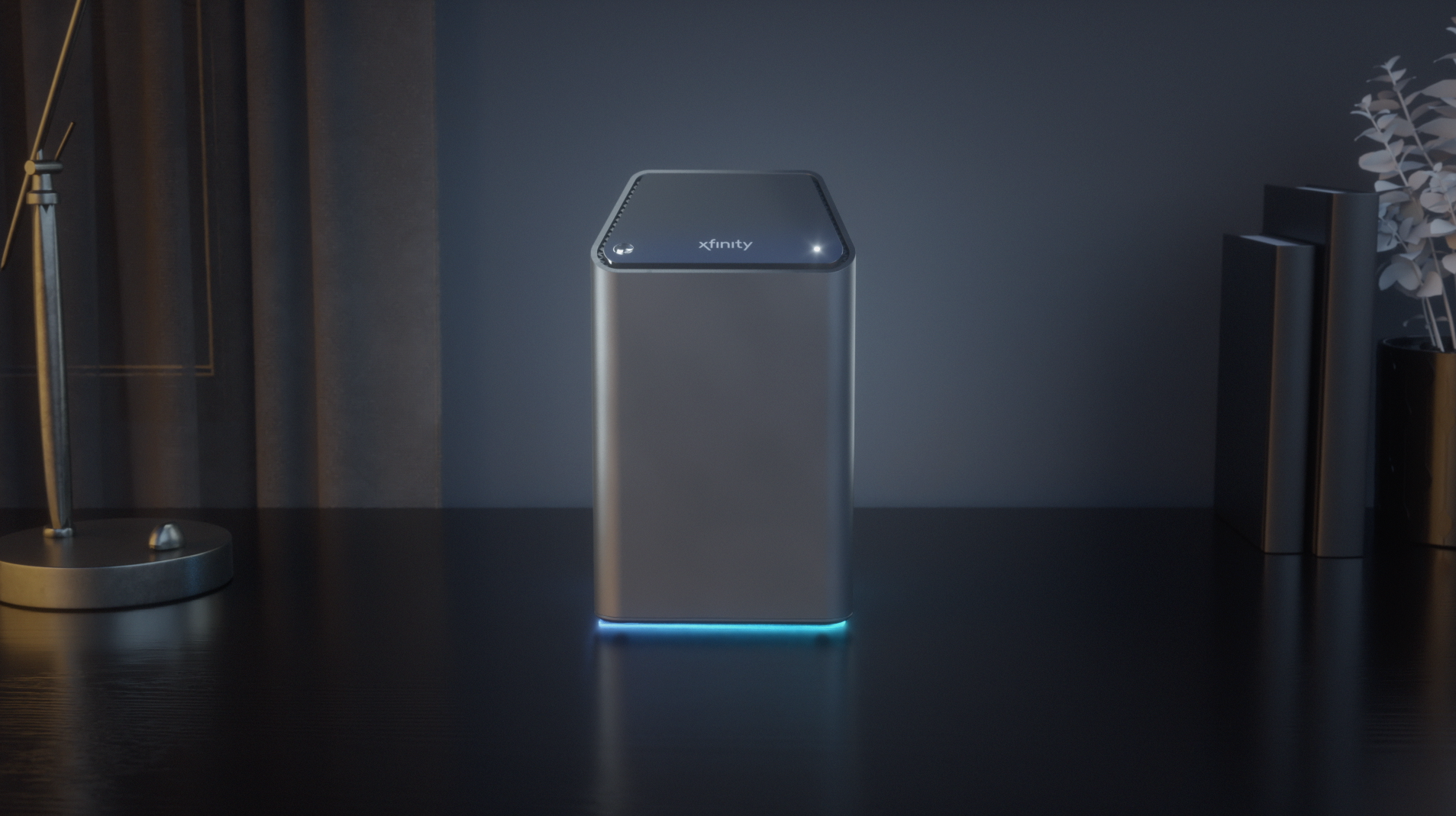
My largest amount of work consists of Showcases for Comcast highlighting their services. These are full 3D animated commercials airing all over the nation and online with a variety of looks, tones, and “worlds.” In the beginning there was a push for a sleek black look ranging across all spots and the shots below highlight that style. The biggest draw to these shots were the colors only coming from the screens with hints of warmth in the reflections on the objects in the world.
The Glow CYC world
My largest amount of work consists of Showcases for Comcast highlighting their services. These are full 3D animated commercials airing all over the nation and online with a variety of looks, tones, and “worlds.” In the beginning there was a push for a sleek black look ranging across all spots and the shots below highlight that style. The biggest draw to these shots were the colors only coming from the screens with hints of warmth in the reflections on the objects in the world.


THE SWITCH TO WHITE
The beginning of 2019 shifted the xFinity world, because the powers that be wanted a change to the look of the products making the overall feel less “masculine” with the tone and feel. It didn’t last long, but the spots we made proved to be a valuable exercise with problem solving and adapting on the fly.
The look eventually changed back to the dark world for the time being until a refresh was needed. Then came the Glow Cyc World.
The ORIGINAL dark world
My largest amount of work consists of Showcases for Comcast highlighting their services. These are full 3D animated commercials airing all over the nation and online with a variety of looks, tones, and “worlds.” In the beginning there was a push for a sleek black look ranging across all spots and the shots below highlight that style. The biggest draw to these shots were the colors only coming from the screens with hints of warmth in the reflections on the objects in the world.

